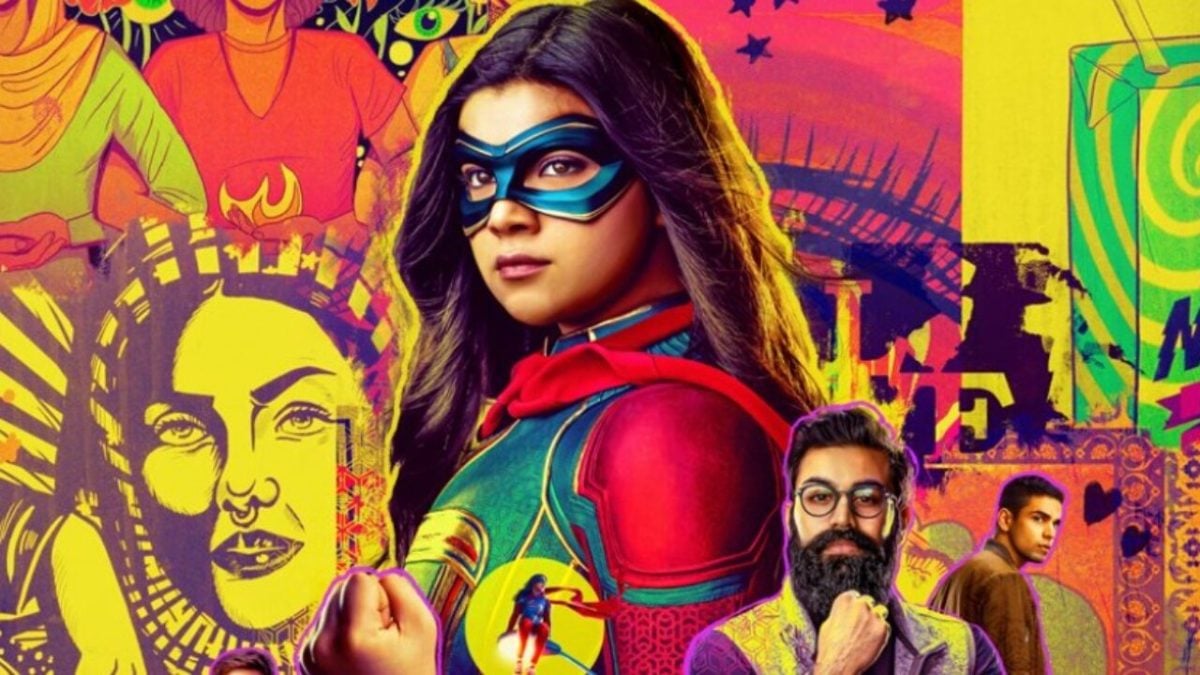
There is perhaps no single better representation of the phrase “If it ain’t broke, don’t fix it” than the Marvel Cinematic Universe. For all the deviations and scope escalations we’ve seen in recent years, especially by way of the Disney Plus shows, the MCU has a tried and true approach to storytelling that we probably won’t be seeing the end of any time soon.
Evidently, the MCU formula boils right down to their promotional content, having a knack for a group shot of the show/film’s big players surrounded by a thematically-appropriate frame, such as the mind-bending multiversal maelstrom present on the poster for Doctor Strange in the Multiverse of Madness.
But in a world of similarly-designed promo posters, who does it the best? With six mainline shows to choose from as we await She-Hulk‘s entry, the folks over at r/marvelstudios have taken to debating which Disney Plus MCU series has the best poster.
The initiating question boasted a selection consisting of WandaVision, Loki, Hawkeye, Ms. Marvel, Moon Knight, and The Falcon and the Winter Soldier.
One user gave a very strong argument for Moon Knight, noting how it was able to abuse star power in a way that none of the other shows possibly could have.
Another user gave points to WandaVision, who pulled off a particularly eye-catching union of aesthetic and thematic aspects. They also showed love for the color-happy Ms. Marvel, which other responders echoed.
But one responder came in swinging hard for Hawkeye, and frankly, we’re having trouble disagreeing with the logic here.
There may not be many folks envying the floating heads poster setup, but with the MCU having done it as many times as they have, creative renditions were an inevitability.
She-Hulk: Attorney at Law, whose promo poster we may have seen had this debate happened a month later, is currently streaming on Disney Plus, with new episodes releasing every Thursday.

