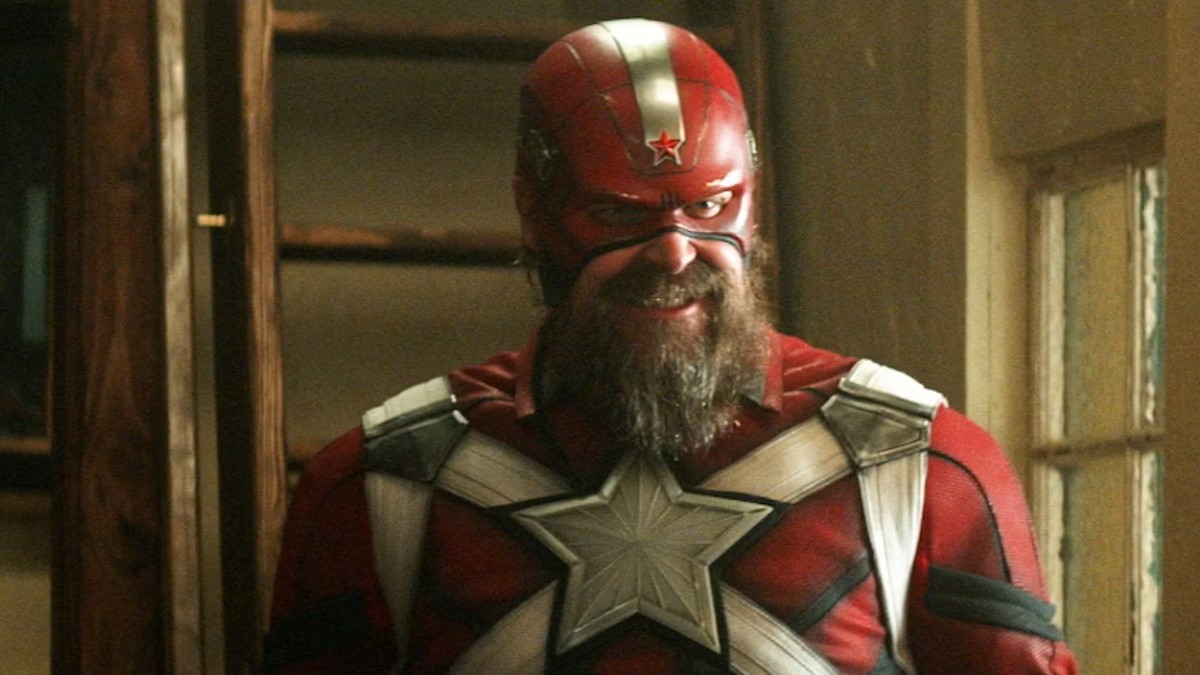
For every character design we see, there are multiple alternatives that were discussed before the directors and art directors eventually made a decision. Who knows, maybe out there in the multiverse there is a Doctor Strange with a purple cape or a gold Spider-Man. In the case of David Harbour’s Red Guardian, first seen in Black Widow, we can now see what could have been.
When it comes to superhero movies they do have the good fortune of working from the designs that already exist in the comics, but as we saw in WandaVision, an exact copy of these costumes can come off looking, well a bit comical. This is when concept artists are brought on board to work with art directors and from example materials to create options that will eventually lead to the final look.
In the Marvel book Black Widow: Art of the Movie, fans can find illustrations as to what alternative designs Harbour could have worn in his first outing as the character. All of them work off of the fact that Red Guardian was meant to serve as the Russian equivalent of Captain America, and that can be seen in the use of the star design throughout these looks, and in many of the designs he is sporting a shield similar to Cap’s.
Of course, he is Russian, so the colors lean more toward red rather than blue and many designs feature the Soviet Russian sickle and a hammer on them as well. The star could also be attributed to Soviet iconography as well given that it appears above the sickle and hammer on the USSR’s flag.
Here is the final design that was chosen for Harbour to wear.
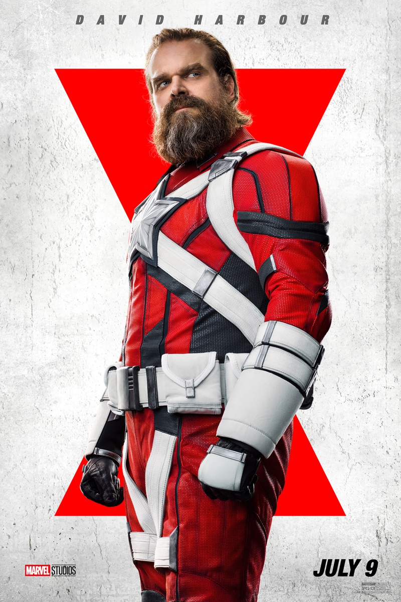
And here are some of the designs that were submitted before they opted for the above look.
This one is a little darker than the final look, with a red and black design. It also features a shield rather similar to Captain America’s with a giant star on it though, again, in black and red with some silver outlining.
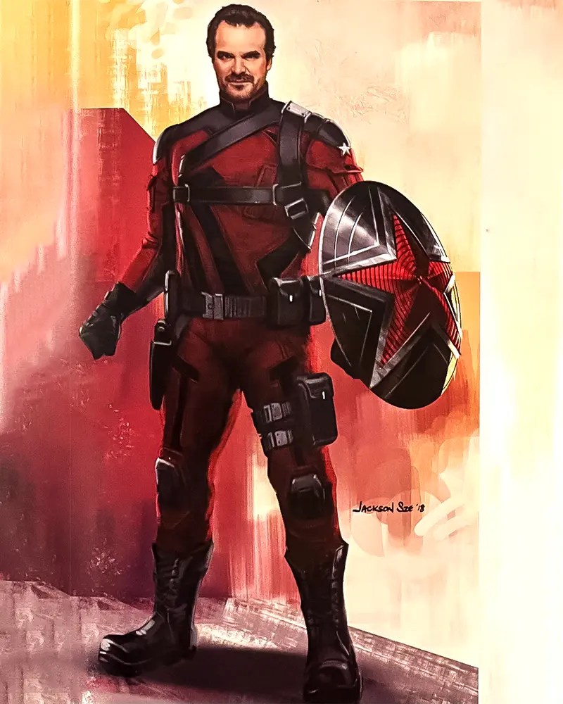
This design goes darker still as it is mainly in black with red accents rather than the other way around. It also features a helmet that reminds us more of Captain Marvel’s than Captain America’s.
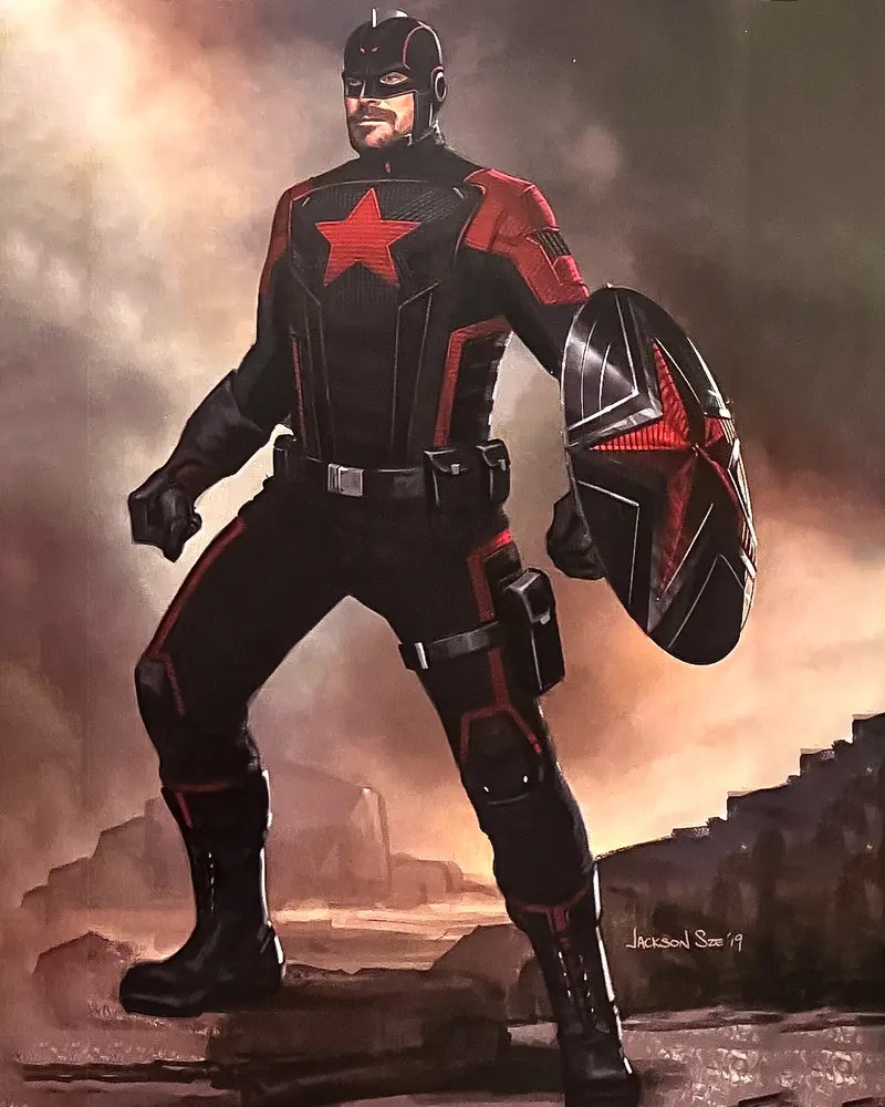
The next design is actually giving us serious Ant-Man vibes thanks to the full-covered helmet. If you take a look at the belt buckle you can also see the hammer and sickle design there. We’re kind of glad they didn’t opt for this one seen as we wouldn’t have been able to see as much of Harbour’s beautiful face.
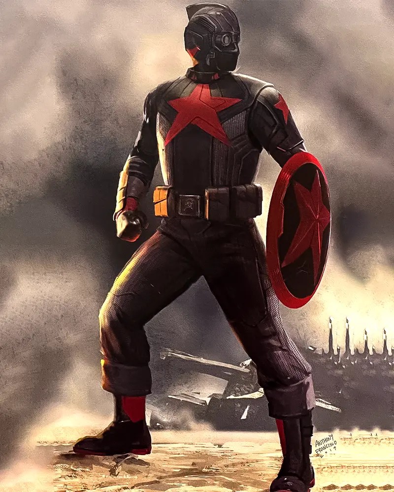
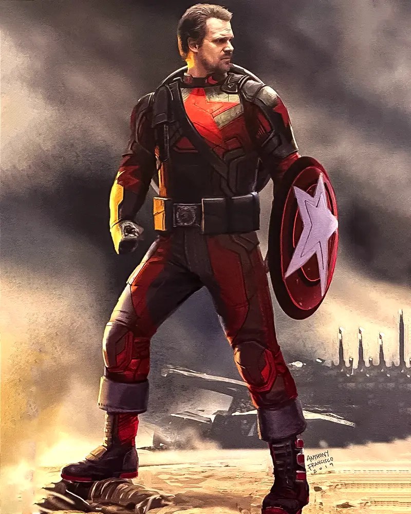
This design sees the character much more armored up and looks closer to the Captain America design we got in Infinity War and Endgame. However, we have to remember that Red Guardian’s suit is old as he was dismissed from his role as Red Guardian in 1991 and had his suit taken away from him. In that case, it would likely not look as high-tech as this just as Captain America’s earlier suits looked less combat-ready and more costume-like.
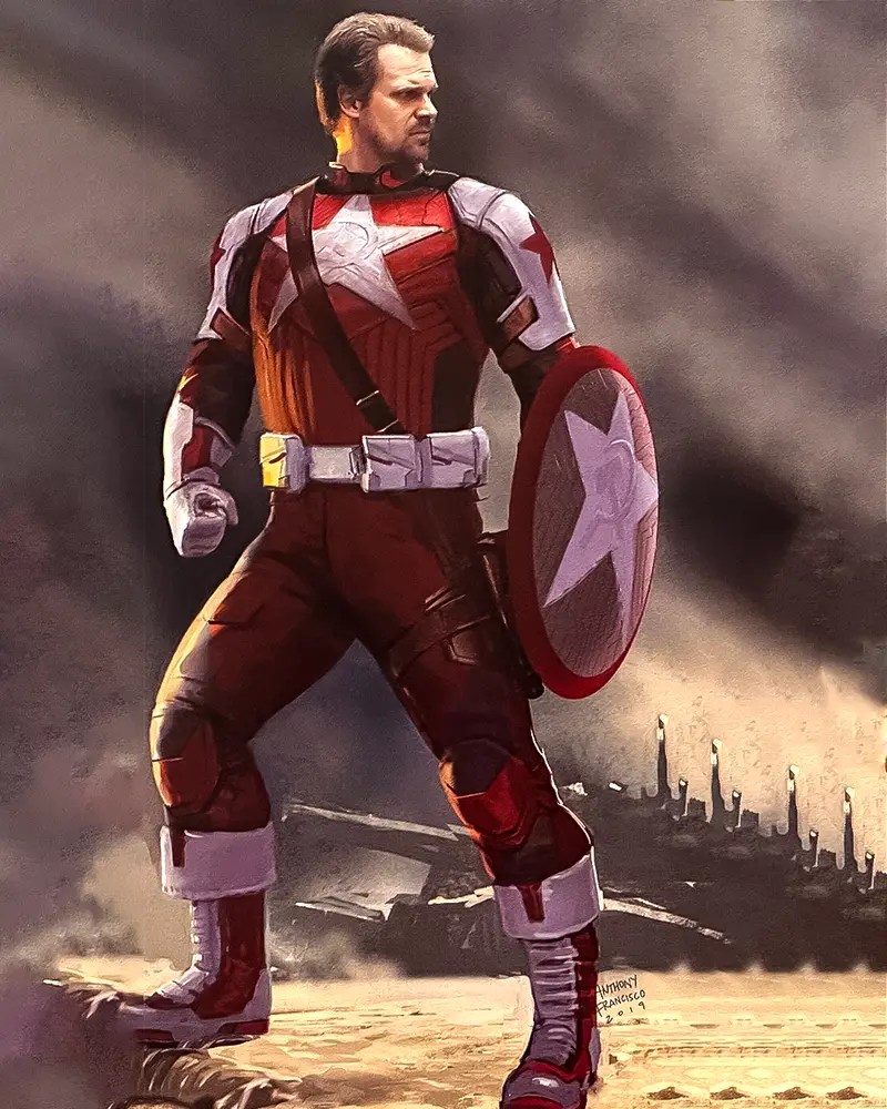
The next design is a little closer to what we ended up seeing, with white and red being the dominant colors. If you look closely you can see that the sickle and hammer design have been added to both the star in the middle and the one on his shield.
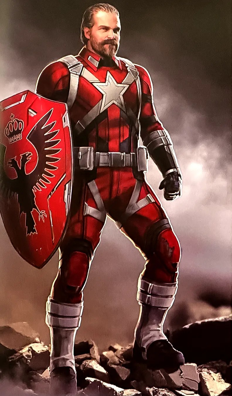
This one is similar to the above, though losing the white color except on the shield. The sickle and hammer has been relegated to just the belt buckle.

This costume design is much closer to the final version, though that shield does leave something to be desired. It forgoes the classic sickle and hammer and instead opts for the coat of arms of Russia, a double-headed eagle with a crown above.
It is always interesting to see the thought process that goes into the designs and costumes that we end up seeing on screen. We know Red Guardian’s costume will get a bit of an upgrade in Thunderbolts and they could draw inspiration from one of the above looks.
All we know is that we will be happy to see Harbour’s slightly unhinged character back on our screens when Thunderbolts lands in theatres on July 26, 2024.

