It’s easy for me, as an aging millennial, to recall a time when Newgrounds Flash games were the peak of free entertainment during after-school evenings. There was this era, around the aughts or slightly after, where Hot Topic-commissioned animations and Happy Tree Friends were the funniest things on the internet to a kid like me. Mario spoof games and violent, side-scrolling action titles cropped up on these free game sites daily, and it’s easy to imagine parodies of Dark Souls doing just the same if it had come out a decade sooner.
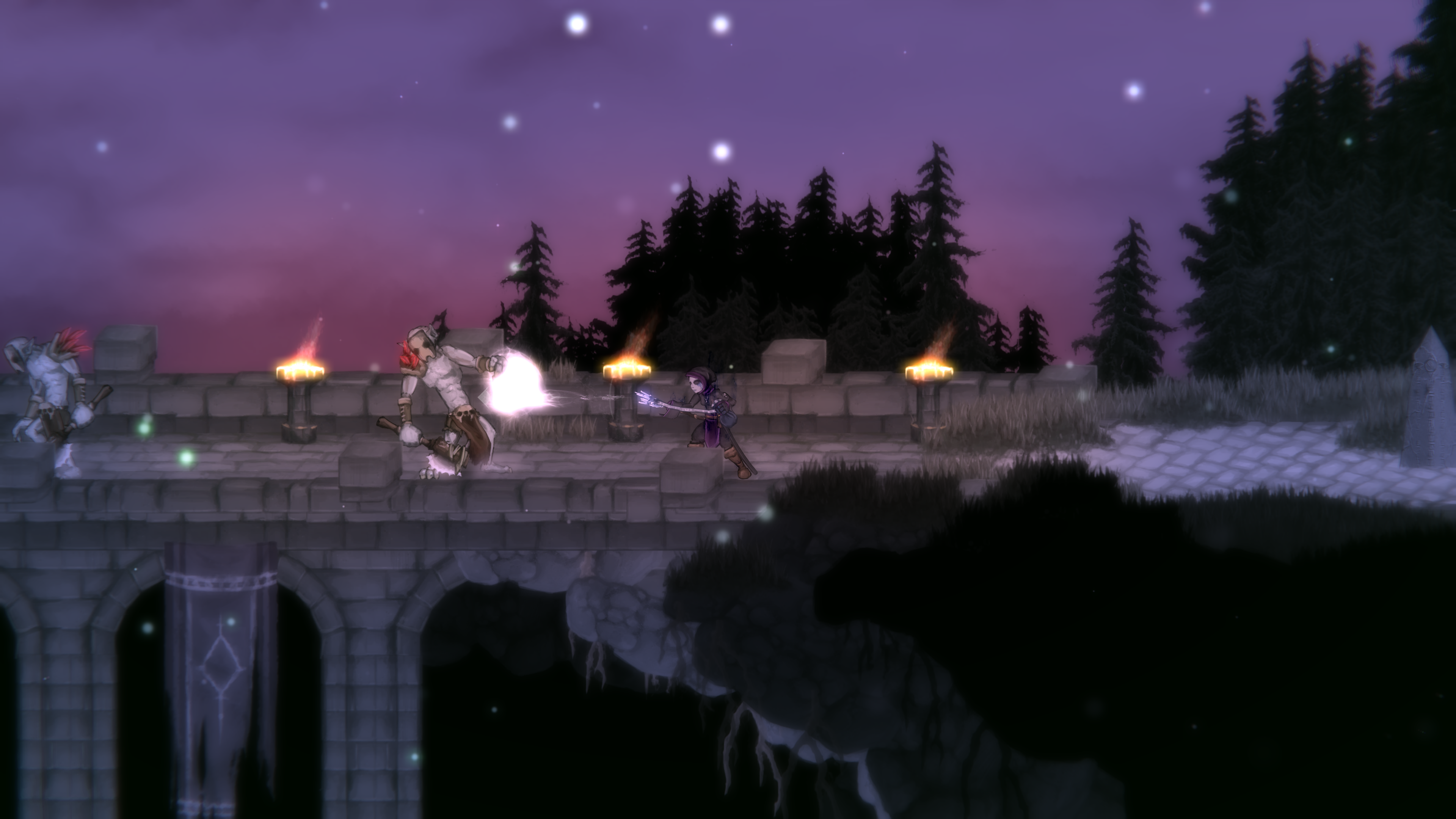
Salt and Sacrifice, whether intentionally or not, smacks of this age. The artistic direction, particularly of the human characters, calls to memory My Chemical Romance animated music videos, or the drawings in the notebooks of the scene kid in your 8th grade English class. I’m sure this wasn’t the intention, but as far back as The Dishwasher: Dead Samurai, developer Ska Studios has been stuck on this aesthetic.
When Rogue Legacy 2 was released recently, I couldn’t help but wonder if the team behind the game that pioneered “rogue-lites” would be able to keep up with industry standards when making a sequel. Somehow, though, they nailed it. The game takes all the lessons from titles it inspired and not only incorporates them but improves on them. Salt and Sacrifice, in contrast, feels like it shows its age from the first moments of gameplay.
Salt and Sanctuary was lucky enough to predate the likes of Hollow Knight, but by now the Souls-inspired 2D action platformer bin is overflowing with quality titles. Salt and Sacrifice is entering the ring emaciated, with a lack of inspiration from the games that it and its predecessor book-end.

Combat feels strangely floaty, as my character was tossed around by bosses and bigger enemies like a ragdoll and sometimes refused to grab onto ledges during platforming segments. There’s a looseness that pervades Salt and Sacrifice, and that’s not what you want when a 30-foot-tall knight is swinging a halberd at your face.
Combat is buoyed somewhat by combos that can be chained together by alternating heavy and light attacks for each weapon archetype. Experimenting and lining up appropriate volleys of attacks for each enemy type gave some addicting intrinsic motivation to engage in combat. Each weapon also has a special ability for a little added flavor, like empowering buffs that can be activated after landing enough strikes.
I particularly enjoyed the unrestrictive leveling system, which simply asks the player to dump their XP into “levels,” no questions asked, in exchange for points to spend in a diverse skill tree. Refunds are simple, and each piece of gear explains what node is needed to equip it. I was rocking a flaming greatsword in no time, and big weapons make my monkey brain happy.

One of the few notable new features in this sequel are the Mage Hunts. You’ll embark on cat-and-mouse chases with bosses throughout each of the five overworld zones, following a trail until facing down the boss in its arena. Afterward, you’ll be rewarded with Monster Hunter-esque loot you can use to craft the boss’ armor and weapons. These can be repeated after finding a special item in case you want to farm for the entire set.
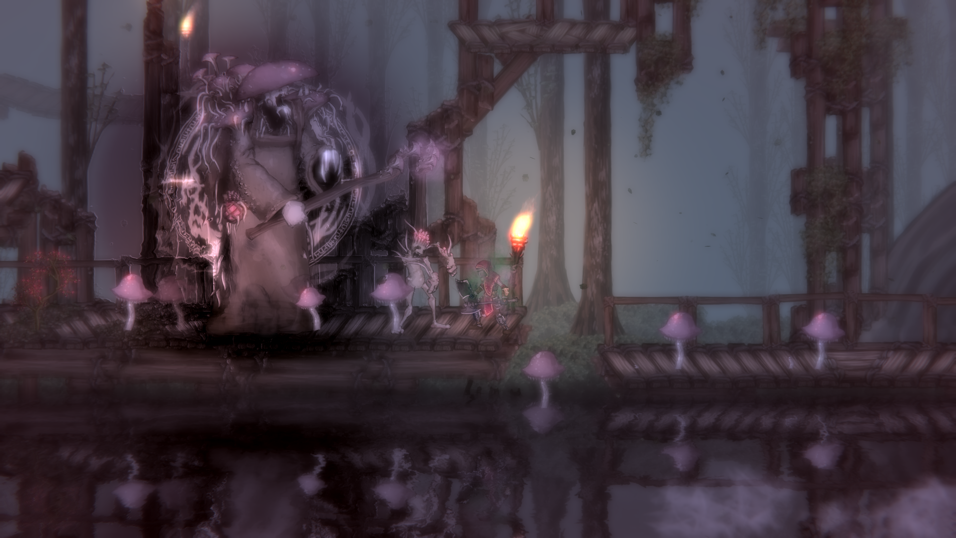
My only real issue with these hunts is that they take a bit of the wind out of your sails when finding a boss. Rather than fighting the hulking monstrosity where you find it, you’re left to backtrack awkwardly through the level before whittling it down. These fights also showcase the weaknesses of the combat — it’s incredibly awkward to dodge some attacks in a 2D plane while the boss’ hitbox is nudging you. For example, I’d sometimes dodge a ranged attack toward the boss, not quite pass through to the other side, and be forcefully pushed to the front of the boss thanks to its hitbox, only to be hit by a melee attack and sent flying. It’s infuriating.
Levels are pretty well-designed, with all the shortcuts and lead-backs you’ve come to expect from a Souls-like. The aesthetics of the zones are surprisingly tame, with the standard forest, desert, ice, etc. theming. Sometimes checkpoints are located too close together only to have long stretches between them seemingly at random, but there was always one relatively close to each boss arena, which is greatly appreciated.

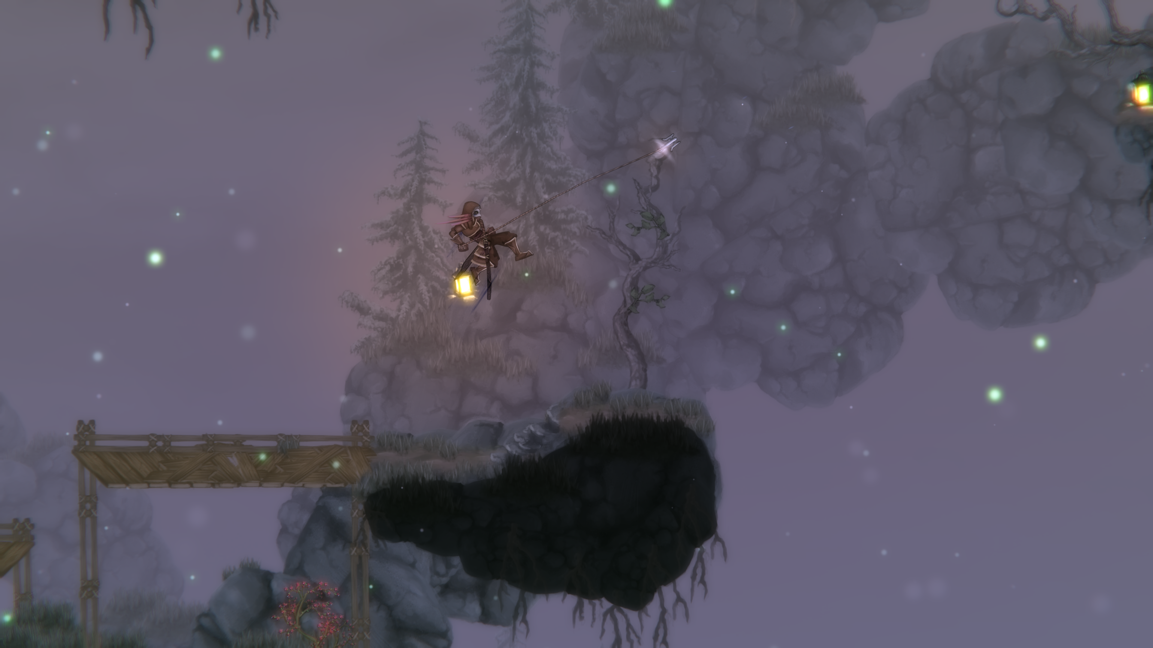
The other notable innovation, at least for the Salt series, is the traversal elements. A grappling hook and powered ziplines are among the ways you’ll journey across the world, and it was always rewarding to spot quicker ways to navigate the spaces you’d be returning to later.
I’m going to sound a little mean here knowing full well that Salt and Sanctuary was made by exactly two people. I can’t imagine the strain of doing art, animation, code, and design all at once. But frankly, the game looks unappealing and in a way, cheap. Things are animated in that paper-puppet way where you can practically see the joints where the characters are rigged up, and as a result, everything looks amateurish. The creature and character designs are pretty good, but as soon as they start moving around (particularly the mouths of the NPCs) the illusion is broken.
Salt and Sanctuary feels like it was made in a vacuum. I wish it had learned more lessons from its contemporaries, but I still enjoyed exploring its world and experimenting with its novel skill tree. If you’re a fan of the previous title and want more, it’s a no-brainer. But for the rest of us who are now spoiled with tighter, more innovative games offering much of the same, it’s, unfortunately, a bit harder to enjoy.
This review is based on the PC version of the game. A code was provided for review by Ska Studios.
Fair
Salt and Sacrifice is a Souls-like that would've made a killing a decade ago. Failing to learn from its contemporaries, it struggles to feel enjoyable in today's saturated market.
Salt and Sanctuary
